Friday, December 30, 2011

Customer Service. retail practice for 2012

Customer service will be the hot button in retail for 2012. 


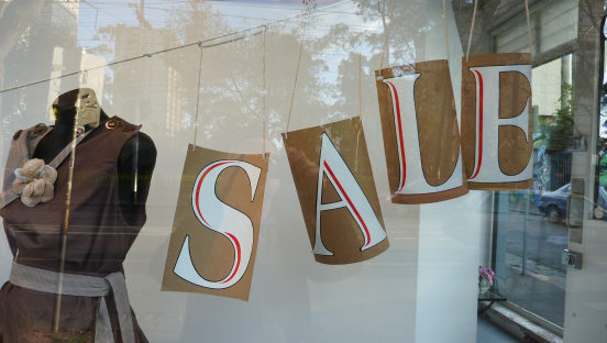
As our dollar shifts and consumers have trepidation on buying non-essentials, retail tries more and more to appease the customer. This means more often than not - banging out constant sales and low prices to reach a price focused customer.  Not saying price focused is a bad word, hell - This Christmas I reached deep into my psyche for DIY gifts and ways I can get more holiday bang for my buck.


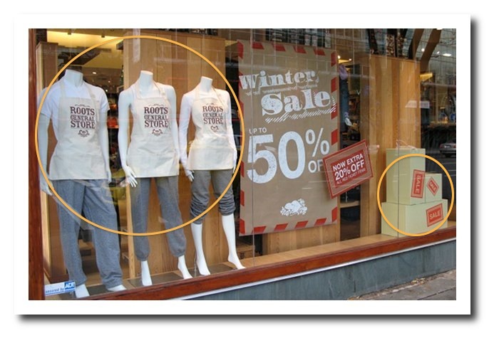
 Stores that pump out sales that 2/fers 3/fers and whatever else in "buy x get y more" are often selling consumers mediocre items. And usually- these items are final sale, either selling off sale or old merchandise or trying to bank out a quarter. Whatever the reason a store will define its success post-sale on the level of customer service. The after affect, the "awesome buy' glow.. This is the moment that the customer will decide if that shop will only be fast-food type merchandise, inexpensive however poor of quality; Or the high end quality shops that sales that seem to have great value. Once this cognitive decision happens, a retailer must follow up with customer service. 


Globally, spending habits have changed and we seem to be gripping our pocketbooks just a wee bit tighter to weather the storm. That does not mean however, that cheap sales mean that the product or store should adopt the cheap attitude. Just because we buy it at an inexpensive price, do not allow the customer service to be lousy, this only repeats that the store is souless atmosphere, doomed to sell at discounted prices forever. Clients need to be coaxed a bit, but gosh darn-it someone will be more likely to buy a high margin, or full priced garment if the store looks and feels high end, making the a sale that more valuable. 


How do we do this, you may ask? Sale times are insane, I know this- I mean... I have had to re-merch an Old Navy after boxing day sale. ( YIKES.

  • Perhaps the database most stores collect can be doubled as mailing addresses, printed cards with a "hope you found some great scores this sale season, can't wait till you see our Spring line" or " Thank you for shopping with us this Holiday Season" 
  • Create customer accounts for the regulars, the clients you will love something- let them know! Don't stalk their facebook of hog their cellphone- a simple email will suffice. 
  • Go that extra step. Does not fit? Rip or damaged? Retailer; you should help the client until satisfied. Spend the time looking for another size at another store and ship it. Eat the expense, that client will acknowledge how you made them feel, trust your experience and recommend you.
  • I know, it may seem crazy- But a "hello, or welcome" acknowledging a shopper without throwing sale knowledge at them at first step. Also, a " thank you" or "goodbye" is a simple, no brainer way solidify that "shopping glow" moment. 


while it may seem simple reading this- you will be shocked at how many stores do not adopt this customer focused policy any more. The air' has shifted  to the client being the one who must do the dirty work, where the policies have become so tight and ridgid consumers are tickled pink when a 15 year old goes an extra mile by calling another store for a replacement- rather than just handing you a phone number. 

starting to sound familiar? 

Make Customer Service the very first policy you have in place as a retailer in 2012, your sales will thank you! 


Monday, December 19, 2011

Great Sale windows from the vault

As we, around the world cram for last minute gifts ( me included ) and begin to settle in for holiday fun, friends and family-- Please take head; Dec 26 marks Boxing day, and the craziness that is JANUARY SALE'S. Here is a look at some fabulous SALE display ideas of years past.
.
image from http://thewindowdisplayblog.com/category/sale/
                                
Check this out from Fenwick's UK store. Big, loud & proud letters. Simple message with some minor details like mannequins dressed and a quick touch of cling. Well executed. This image is also really cute- love the letters again, even if it may be in a smaller window, I would say that this almost creates a higher impact. 

  image from http://alexandrawickens.blogspot.com
                                    
 This display has some serious "wow" to it, perfect composition & the tie into candy canes and christmasy things is great
.
image from http://visualmerchandising.net.au/gertrude-street-windows/
On the flip side of large letters taking over windows- this display captures a simple, clean and modest vibe yet presenting SALE in a pretty way. had painted letters backed onto brown paper are suspended along a twine clothes line.. exuding a bit of thriftiness within this store. 


GOODMORNING! thats all i can think of when looking at this method os "SALE"ing windows. Lots of signage- no bust forms, manns or props. Just SALE. I think this message is pretty clear. Does it make me want to go in? not sure. But kudos on tell me me what kind of sale!

image from http://merchandisingblog.inspire.ca/
This roots display is awesome- professional and inspiring. Lots of visual impact with no big bold red letters, no crazy busy window displays... The tidy appearance and soft, neutral colour palate is welcoming and it has 3 main areas the eye looks at. Center- the literature or info of the store, and creating both balance and focus the circles ( hoola hoops or decals..) draw your eye to the sale aprons of the store staff and back down to the boxes of sale merchandise. 

image from www.thewindowshopper.co.uk/

This is from Stella McCartney via The window shopper.. its not necessarily a winter or boxing week theme- but fun none the less. Using over sized LEGO, the word "sale" is built with some gorgeous garments that surround it. This idea could be easily translated using toys or holiday colours for a January vibe. .. Or hell- maybe its a great way to remind clients that your store has the best is cruise & vacation wear sales.


Thursday, November 17, 2011

The Worst holiday merchandising from around the globe.

aahhhh.... full swing into the holiday season. Tis' the season to spread the holiday cheer in your storefront and windows. Christmas can make or break a year for a retail which is why so often people think ``MORE IS MORE!!!``when dumping tinsel, bobbles and trees in their windows. So here, my darlings, is the obligatory holiday window post- just.. different. This is my homage to the worst.windows.ever. First up, this little ditty makes me wonder what happened at a shop...
So- I think it is really great when youhave creative and inispired store help working on windows or interior displays, it shows great interest in design and not to mention the work for the company. However... this is what happens when cotton batten goes on sale. When working on holiday windows- think outside the box when wanting to create 'snow'. More often that not "snow" looks junky, and unfocused believe it or not. All I can do is stare at the 3 feet of batten in this window. next
Okay. so - I feel like this window had lots of potential. But something happened along the way. This window looks pretty small, so one must be strategic in product placement. The story is unclear and is pretty cluttered. I am also unsure what the story is telling, other than that polar bear is terrified of the heavy, low swinging Christmas lights.... next
As a professional I can say this; Never mix the holidays with meat. In a window. Ever. next
These two are gems. Why? Because whomever painted these windows had some serious conviction in painting a whole story. However, two main rules apply when using a paint or mural to attract clients, 1) If you are going to paint a window and invest the time- do it right. Hire pro's who either paint murals or merchandisers, as when a mural turns out badly the image of the store is reflected as bad as well. Not a great artist? stick to simple paint scheme and easy drawings.
2) if you sell merchandise - add merchandise in the window, or as part of the display. As an example these windows were painted for a bakery- infuse bread, rolls and other "sellables" as inspiration. Create a garland from painted dinner rolls, french bread to look like stockings etc. If you have the space- use it. next
okay. another fabulous example of when batten goes on sale. Batten can be fabulous! but not so nice when not tucked in, or detailed. The house is the focal point, however there is not much else happening. Drab. too bad though - the possibilities are are amazing. next
I um.. don't have much to say here- other than stop the window brutality. next
We aren't just speaking to small- medium retail. This is a window from Barny's a few years ago. It was a collaboration of Illy coffee and the food network. I say it definitely had a great concept- but the execution was ... ok. While there is a focus to this message- the visual clutter does not work with similar colour palette, let alone metallic. The sheen of the cans are reflecting light and interest causing visual noise- but too much. Think, a group of musicians playing the violin, off key and all together. That's what this display is doing to me right now.

Friday, November 4, 2011

Retail Therapy 101

This whole idea of Displayology steamed from pacing up and down countless streets, gazing in shop windows and seeing what stores sucked me in with their atmosphere and shoppablilty, and those that did not. The ones that didn't I realized that they all had the same fundamental flaw -- UGLY. I don't just mean, oh hey, your store presentation is lacking and your shelves are dusty. But there is a lot of people out there who generally cannot see the real, tangible, financial benefit to having a beautifully merchandised store. Take the images for example, a before and after. before: yuck.o.rama
this was a big project for me- Basically this area was getting such slow reaction from customers. it made ZERO sense. The spot in the store was designated for sale, and it was during a clearance time so there was tons of sale and lots of leaness in regular priced merchandise. The problem most retailers have is presenting sale pieces like they are junk. If you , the store , appears like you dont even want it- why would a client? RETAILSEN$E people!! the colour patterns were choppy, the labels ripped up and just... generally.. sad. with some time, some careful grouping and time. I turned that terrible fixture into.. after: volia!
The trick here was taking of the random sale bits an pieces can be lovely, minimal replenishment requirements from a VM standpoint, and a powerful looker of a fixture! Employing several techniques here, not just colour coordination. the shelf height are positioned in even & odds, and mirroring each other. now this area is a reg. priced & sale section combining margins, and getting rid of the old and shopping the new! The small number of mis-matched items went to the clearance area on the other side. Do not underestimate the power of visual merchandising. The pro's, knows!

Thursday, November 3, 2011

Welcome to Displayology Toronto ! So Excited to finally be up and ready to be a part of your display requirements- Displayology Toronto offers retailers, and home owners alike beautiful vignettes with lasting impressions with zero work. We are specialists in Visual Presentation and Styling, one of the first 'merchandising + visual presentation' firms in Canada. Using Displayolgy, retailers have saved thousands hiring independent window display + interior space designers Displayology proud to finally be online, in blog and on twitter. Usually acting as principal/owner @lindziarmstrong + lindziarmstrong.tumblr.com - this blog will morph twitter and my tumblr together. But thats for later In this blog you will find projects I am working on, ideas, concepts, Merchandising do's + dont's on styling and visual presentation. enjoy! Lindzi